Instructional Design on Mobile: Prototyping and Testing
Select-all-that-apply practice questions are a common question type for Chinese learners. How might we show answers and feedback clearly on mobile?
THE TASK
Imagine you are doing a quiz on your phone. After you selected each question, you’d see whether you got it right or not. With a multiple-choice (MC) question with only one correct answer (aka “key”), it might appear quite straightforward: the answer you selected was either correct or incorrect — and you see the correct answer if you selected the wrong one. For questions you are asked to “select all that apply,” however, the feedback mechanism becomes much more complicated.
For a language learning app that our team has been developing, we wanted users to be able to receive instant feedback on multiple-choice questions. Often times these questions are the “select all that apply” type, which meant it was crucial to convey that feedback in a clear and friendly manner. I volunteered to be the designer for this problem and collaborated with a group of learning scientists and language assessment specialists.
THE COMPLEXITY
Why is it difficult to design a feedback screen for such “select-all-that-apply” questions? I have collected a few reasons.
There is A LOT to show: what the user selected, and what the correct answer includes. The options a user-selected might be partly correct and partly incorrect; they might also miss some correct answers.
A “select all that apply” question might have more than 4 options, which usually require scrolling on a mobile screen.
As I was doing my initial research on current practices, I found one example that stood out, which helped me reflect on some heuristics in designing interfaces and interactions. I’ll attach only the Feedback screen for now.

To practice Think-aloud on this screen, I have collected some initial feedback:
It stands out to me that A/B/D are the correct answers. (For people with green-red color-blindness, I wonder if the check and the cross would be discernable enough to tell.)
I noticed the underlined B/D…what does that mean?
Oh, A is also boxed with a thin line.
Did I select A/C/E? I think so, logically speaking.
Wow, that took some time.
I decided to bring the Selection screen into the picture. Here it is.
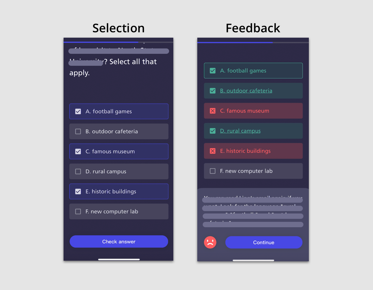
Now seeing the Selection screen that precedes the Feedback screen, I have a few more questions. Firstly, on the Selection screen, A/C/D have been checked ( ☑️ ) on the left, indicating that the options have been selected. However, on the Feedback screen, the same check ☑️ turns into representing the selection correctness. This same element does not mean the same thing across two screens.
MY ATTEMPTS
I decided to prototype a few screens to see if I could improve this design. My first challenge is defining the various instances of each option in a select-all-that-apply question. Recalling my knowledge from my Language Assessment course for my Applied Linguistics degree, I recall that an option that is correct is called a key, and the option that is incorrect is called a distractor.
For example, in Feedback Example 1 below, the user has selected the second option (“ba”), and it turns out that the other option (“te”) is the correct answer. In this case, the user has selected a distractor. In Example 2, the user has selected a key.

Examples: Multiple Choice Questions with One KeyIn a select-all-apply question with potentially more than one key, the variations greatly increase: a user might have selected both a key and a distractor; they might also leave out a key and/or a distractor. For example, in a 5-option (ABCED) question where the keys are A/B/D, leaving the distractors to be C & E. So, if this user has selected A/C, then they have
correctly selected a key (A)
mistakenly selected a distractor (C)
missed a key (B)
correctly rejected a distractor (D)
Yeah, it is an extreme example. From this, I started to understand more deeply why it is not an easy task to design for the feedback screen — since each option has four possible states, it is important to (I) provide enough visual cues to the user so that they understand what happens to each option while (II) not overwhelm them with design elements like color, font, animation, and so on.
Labeling Instances
To tackle the challenge of providing clear visual cues to users, I realized that labeling them could be a good start. I reconnected with things I learned in signal detection theory, where the four states could be presented with a meaningful set of labels.

Labeling InstancesSpecifying Design Choices
For accessibility purposes, I made sure that one design element does not work as the only differentiator between two instances. For example, color should not be the only signal that differentiates keys from distractors — usually, a check or cross should be paired with it so that green-red color blind folks will be able to tell one from each other. Also, a design element should only be signaling either user selection or answer feedback. For example, if the black border is an indication of user selection, then it should not also indicate whether the option is a key or a distractor.
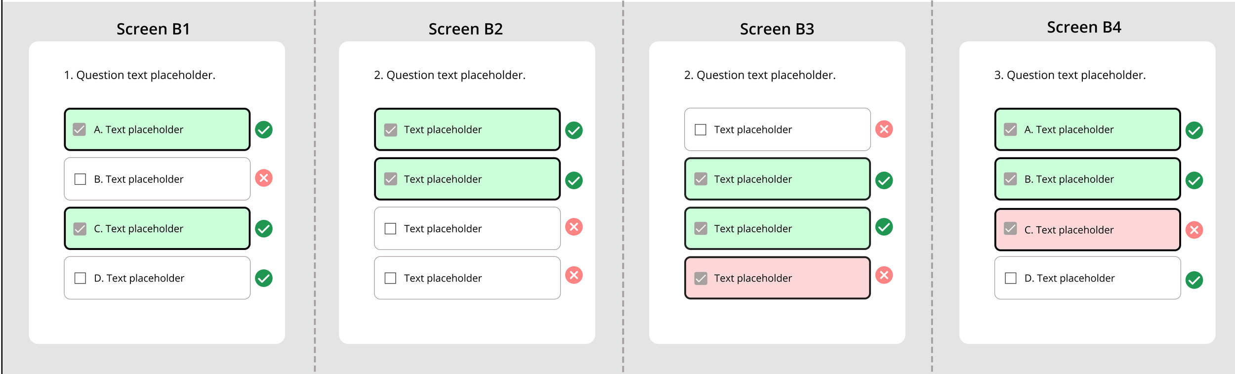
Bearing these principles in mind, I developed the following three sets of rules. In each column, the Scenario remains the same (same User Selection and same Keys), and in each row, the design rule is consistent.

Specifications for 3 Sets of DesignsHaving laid out all these versions of designs, I know that I have spent enough time with them — it’s time to get some feedback! I started to quickly show them to my teammates (“internal testing”) as well as my friends & family (“external testing”).
FEEDBACK
Comments from colleagues
I reached out to the learning scientists and assessment developers on my team and asked them for pedagogical principles. They shared that “as long as it’s clear what they got wrong and what the right answers are,” we are good pedagogically. Then I showed the three design versions to them.
Having expressed observing clarity of User Selection, most of my colleagues showed concerns about the ability to spot answer keys: “if you only see green and checkmarks, it looks to me like there were no errors.” They even shared feedback from the user’s voice: “as a user, I would benefit more from a more explicit indication of my selection being wrong” (with an “x” as an indicator, for example). The bottom line, they don’t mind having the incorrect options called out, and for now, Rule B was the most preferable.
Polling results on social media
After testing these designs with my friends on social media, I found more evidence in the demand for visual cues that tell keys from distractors. The way I facilitated these “tests” was through the Poll feature on Instagram Stories. Since Instagram allows polling between only two options, I sent out three polls to compare Rule A & B, B & C, and A & C. Just FYI — polling between two options each time sounds like a limitation, but it actually makes it easier for users to make a decision based on given information. (Feel free to dive more into this theory, Diagnostic feature-detection hypothesis,” Wixted & Mickes, 2014.)
In the polls — instead of asking my friends to tell me “what did the user selected and what are the answer keys,” I asked them to compare the respective designs and vote for the one that was “clearer about both User Selection and Keys.”
I had a few reasons for doing that. Firstly, during my initial “pilot dry run” on Instagram Stories, I noticed that the success rate of their replies was very low (also an obvious failure of my designs). My friends also mentioned that they would spend a long time trying to figure out the “right answer” for my question, even after I had specifically asked them to just speak their intuition. Furthermore, I thought it was not quite authentic to ask them what they thought this “hypothetical user” had chosen because the question did not contain any real content.
Later, when comparing results from the three polls, I noticed that in both polls that included Rule C, Rule C was rated the less preferable one — it was the loser among the three initial designs.
ITERATIONS
Having collected feedback from my colleagues and social circles, I decided to pick the so-far winner, Rule B, for a closer look and iterate on it.
Rule B — Original VersionThere are a few problems that I can easily improve:
There are multiple design elements that indicate User Selection: the bold black border, text highlight, and grey check on the left — I can make it more concise.
The current design calls out FALSE ALARM (user selects a distractor) by highlighting the option in red with a red cross on the right, but it does not call out a MISS (user misses a key): there is only a check attached on the right. I should make them more balanced.
Do users still need to need to be bothered by a red cross as a reminder if they have already successfully rejected it as a distractor? (Ex., B in Screen B).
I came up with the following design, hoping to have addressed all three issues above. Personally, the change I am most thrilled about is greying out those crosses when they are already correct rejections by the user.

New DesignI quickly checked this with my team and received positive confirmation. One thing they were unsure about was whether the “callout of the unselected correct option” (dashed border when it’s a MISS) might add too much information to the screen.
FINAL DESIGN
In my final design before it went for development, I moved the correct/incorrect check & cross closer to the option and added a “KEY” next to the key option, just so that it is as clear as possible that those are the keys. However, personally, I am still leaning toward the previous dash-border design, where a MISS is called out. What do you think?

Final DesignFINAL TIPS ON USING FIGMA
This process has helped me get familiar with Figma as a design tool, and I’d be more than happy to share below how I learned to use the Swap Instances feature to standardize the process. As a result of using this feature, for example, I could easily swap one option from an “unselected key (MISS)” to a “selected distractor (FALSE ALARM)” and layout variations of answer combinations for that design version.
Swap Instances in Figma
The way to create instances is by adding the instances you’d like to swap among each other on the same frame (“instances for 4 signals”) and make each of them a Master Component.
Create Instances in Figma